


archi've Logo Manual
The archi’ve conference is a creative and hands-on gathering centred on journaling as a personal, physical practice. This project encompasses naming of the brand and tagline, establishing the logo and its guidelines, creating a manual for its visual identity, and expanding the brand through applications like business cards, email signatures, and a favicon icon.

Objective
The main goal of this fiction conference was to invite people to explore diverse approaches to journaling that align with their own lifestyles while encouraging and emphasizing the physicality of carrying, using, and customizing a notebook. Through the logo and its applications, the materials and individualization of journaling were the prioritization, governing my design choices.
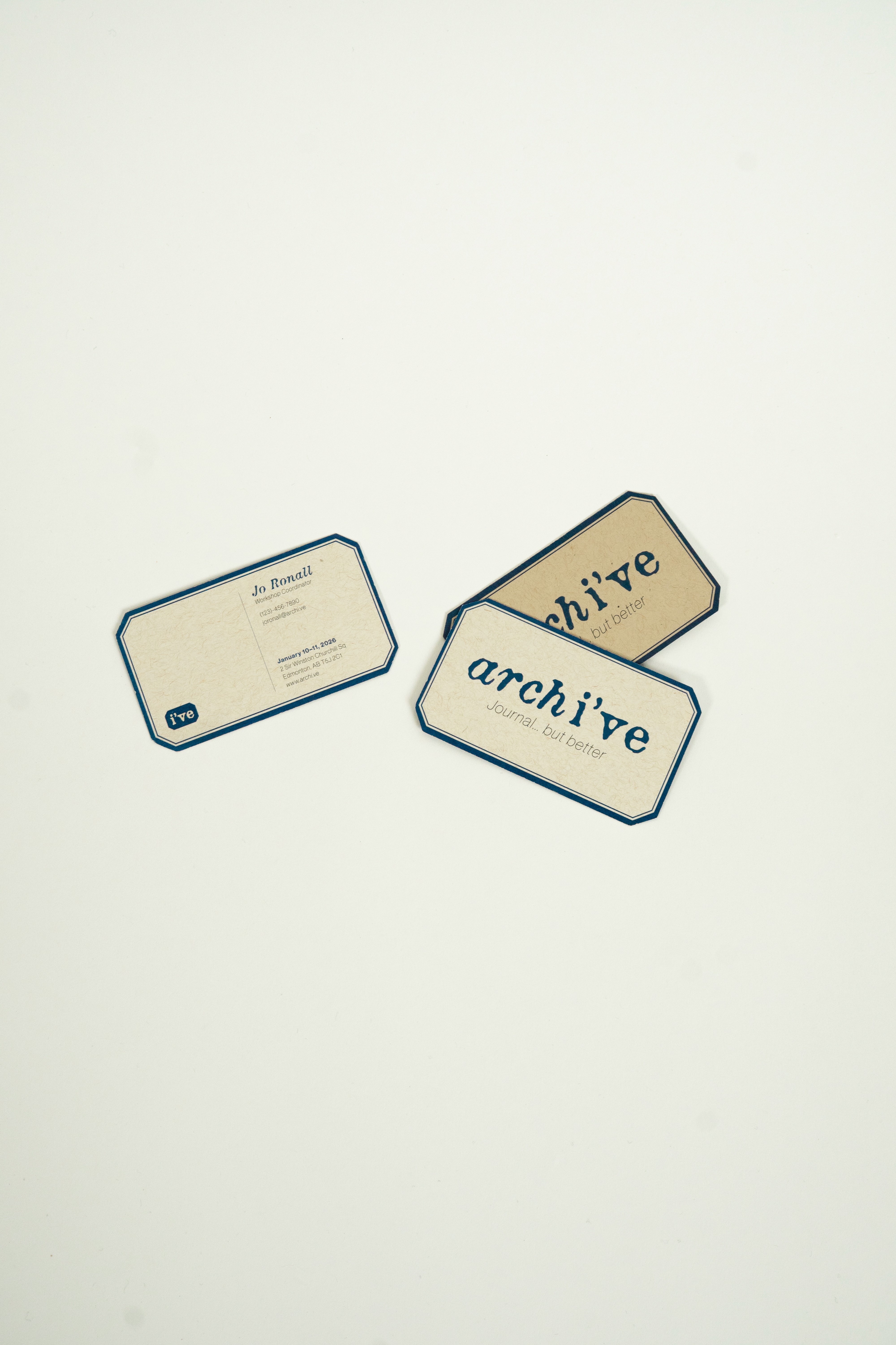
Execution
As the focus was on physical journaling and customization, the logo was modeled after labels on the front covers of journals, similar to a common composition book. The off-white background emulates slightly aged paper, the blue mirrors ink, and the main font mirrors handcrafted typography with the tagline font to support it. Through testing, I was able to ensure legibility on both print and digital platforms. The size of the logo guidelines manual, 8.5 in by 5.5 in or half of letter-size, ensures that handheld tactile aspect to even the guidelines booklet.